
Those who trade with technical analysis have identified chart patterns in the stock, usually with a candlestick chart. Technical analysts, those who study technical analysis, are able to use these chart patterns in an attempt to predict price movement.
Before learning chart patterns though, the traders should understand the concept of support and resistance.
What is Support and Resistance?
Support and resistance lines are price levels at which the stock tests, often multiple times. They are points of supply or demand of the stock.
The concept of support and resistance is one of the most discussed topics in technical analysis and the stock market because it leads to so many other topics like chart patterns, indicators, Elliott waves, and more.
You can read more on support and resistance here.
Support and resistance is often called the foundation of technical analysis, because support and resistance levels can form different chart patterns. But what chart patterns can these levels create?
3 Chart Patterns Every Trader Should Know:
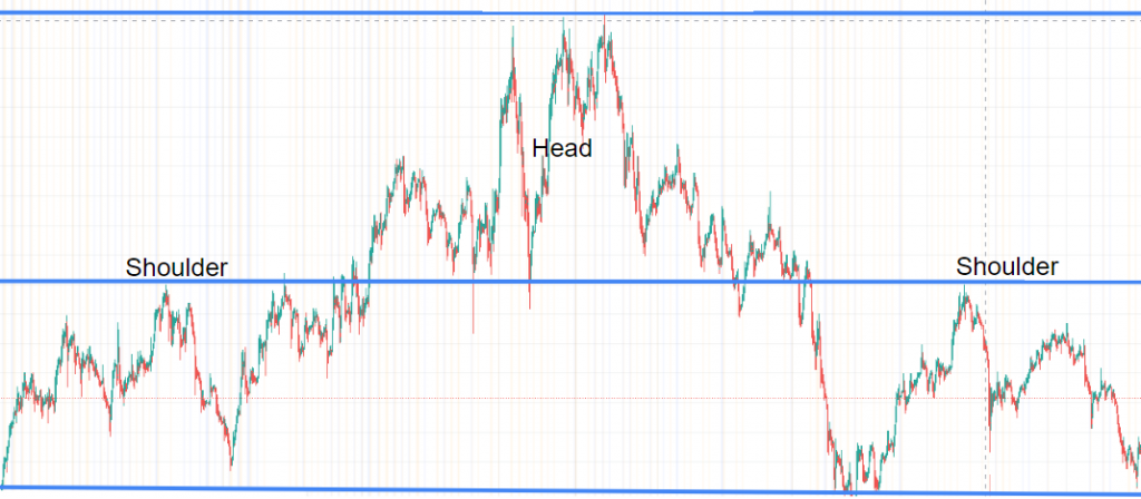
The Head and Shoulders Pattern
The Head and Shoulders pattern generally can be seen forming a market top, because it is a reversal pattern. It usually is identified to be created off of an uptrend.
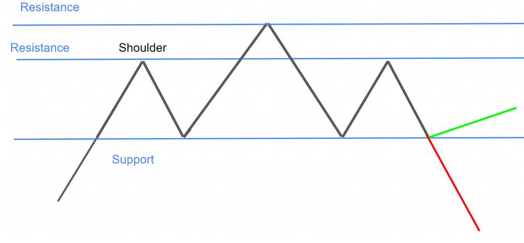
The pattern has three main parts: The first shoulder, the head, and then the second shoulder. There is also a neck line present below the two shoulders.
As the uptrend hits a point of significant resistance, the peak of the first shoulder forms. The chart then tests and bounces off that price level and often meets this bottom support line (neckline). It doesn’t have to touch the bottom support line, but it should decline far enough to form a trough and should not decline past the bottom support line.
As price starts to move back up, the head portion begins to form. The head is able to break past the resistance line at the peak of the shoulder, but ultimately tests and fails to pass a significant resistance point of its own.
The head can also form a market top, where news or some other factor can push price back into a decline.
As the head portion tests the bottom support line, it may bounce off and form the next and final shoulder. The result of this shoulder decides if price reverses or not.
Generally, the price will reverse as the Head and Shoulders pattern is a reversal pattern, but always be ready to react if price does not reverse.
Learn how to trade the Head and Shoulders pattern.
The Flag Pattern in the Stock Market
The Flag pattern has two main parts, the pole, and the flag. There is also a breakout after the flag. When studying a Flag pattern, technical analysts often use a candlestick chart.
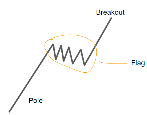
So, the pole would start to form which can look like a trendline, and then the flag would start to form and move in a counter direction to the trend. The flag part can look like a Rectangle pattern and is often an area of consolidation.
Price in the Flag part would eventually break out past a line of support or resistance. In this case, the price performs a bullish breakout, continuing the original trend.
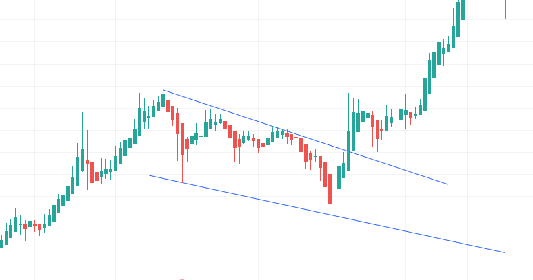
In this example, we see a possible Flag pattern. The pattern begins with an uptrend, which can be labeled as the pole. Then, the stock moves in a corrective fashion to the trend. This is the flag. Notice that the flag part slowly consolidates.
The Flag pattern then breaks out, continuing the original trend.
According to Investopedia, in a flag pattern, the bottom part should not exceed the midpoint of the pole that preceded it.
A Flag pattern does not always occur on a bullish trend, as there are two types of Flag patterns.
Learn how to trade the Flag pattern.
The Double Tops and Double Bottoms Pattern
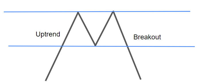
A diagram of the Double Top pattern is seen in the picture above. It starts out with an uptrend, then encounters an area of significant resistance (the top blue line).
After testing and bouncing off this top resistance line, the chart moves down and tests this bottom blue line, which is a level of support. The chart then bounces off of this level and hits the top resistance line again.
After bouncing off of the top resistance line, the chart comes back down to meet the support line, except in this case it breaks through the line. This breakout forms a downtrend which is sometimes categorized as a reversal.
It is named a Double Top pattern because the stock’s price tests the top resistance line twice, creating two tops.
This is generally how a Double Top looks and acts.
What Is a Double Bottom?
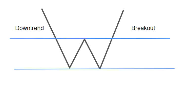
A diagram of the Double Bottom pattern is seen in the picture above. It starts out with a downtrend, then it encounters an area of significant support (the bottom blue line).
After testing and bouncing off this bottom support line, the chart moves up and tests this top blue line, which is a level of resistance. The chart then bounces off of this level and hits the bottom support line again.
After bouncing off of the bottom support line, the chart comes back up to meet the resistance line, except in this case it breaks through the line. This breakout forms an uptrend which is sometimes categorized as a reversal.
It is named a Double Bottom pattern because the stock’s price tests the bottom support line twice, creating two bottoms.
This is generally how a Double Bottom looks and acts.
Learn how to trade the Double Pattern
Where To View Charts:
Most charting platforms have some type of candlestick feature, but here are some popular charting platforms:
TradingView
TradingView is one of the most popular online, free, and compact charting platforms. To view a stock with a candlestick chart, enter the stock’s name or ticker in the search bar and press enter. Then, press the button in the top left, next to the “Indicators” button that looks like this:

Then, press on “Candles”. Some may prefer to use the Heikin Ashi candles discussed above, as they may seem simpler.
Yahoo Finance
Another popular online charting software, powered by Yahoo. To access the candlestick chart, search up a ticker in the top search bar of the homepage, double click on the area chart, press the button that looks like this:

And choose “Candle”.
Stock Charts
Stock Charts may be a bit confusing for beginners, but it is very compact with features. To access a candlestick chart, search up a ticker in the search bar, and wallah, a candlestick chart has appeared. You can change the settings as you wish.