
Candlesticks are a Japanese invention thought to be developed by Munehisa Homma. Candles are used in technical analysis to identify trends and patterns in a company’s stock in more detail than just a regular line chart. They represent the emotions of traders and a more detailed look at a stock’s price.
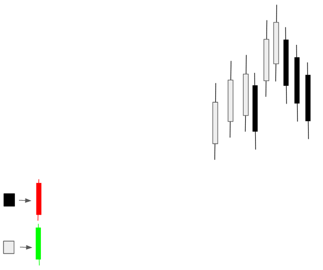
For most charts, the green candlestick is considered bullish and the red candlestick is considered bearish. These candles can sometimes also be shown as white and black.
Quick Notes:
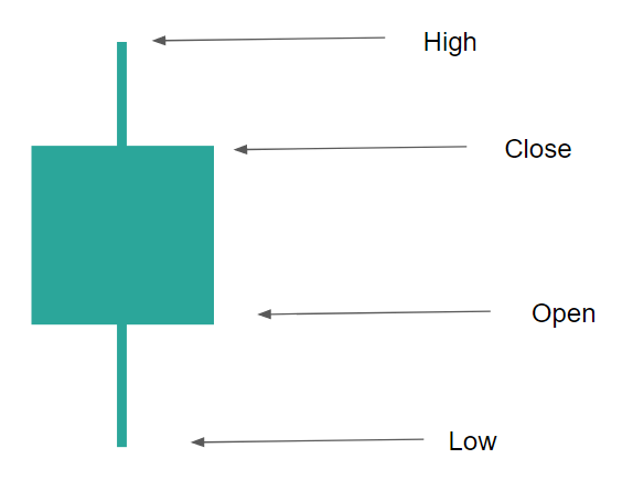
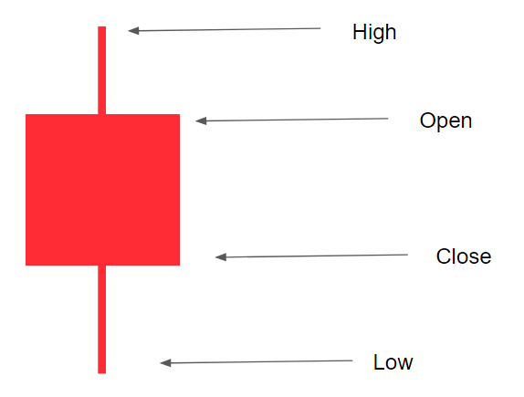
- Parts of the candlestick include the body, the wicks, the high, the low, the open, and the close.
- There are bullish and bearish candlesticks.
- A bullish candle becomes bullish when the close price is higher than the open price, representing an increasing price.
- A bearish candle becomes bearish when the close price is lower than the open price, representing a decreasing price.
________________
Parts of Candlesticks
A candlestick has various parts such as the wicks, the body, the high, the low, the open, and the close points.
Also Read – How to Use Candlesticks and Why You Should
The Body: The body is the main rectangular part of the candlestick, often between the two wicks.
The Wicks: The wicks are the lines, often seen on the top and the bottom of candles.
The High: The highest point the price reached during that specific candlestick.
The Low: The lowest point the price reached during that specific candlestick.
The Open: The price at which the candle started at the beginning of its time frame.
The Close: The price at which the candle ended at the end of its time frame.
Bearish VS Bullish Candlesticks
The bullish and the bearish candlesticks are slightly different in terms of parts.
A bullish candle becomes bullish when the close price is higher than the open price, representing an increasing price.
A bearish candle becomes bearish when the close price is lower than the open price, representing a decreasing price.
Candlesticks may act as a foundation for analyzing stocks and technical analysis.
Heikin-Ashi Candlesticks
Heikin-Ashi candles are a type of candlestick that many traders prefer, often because they look simpler than regular candlesticks. Heikin-Ashi candlesticks are based on two-period averages in an attempt to make trends simpler to spot. So, instead of a traditional candlestick trend:
The Heikin-Ashi candlesticks make the trend look like this:
How to Read Candlestick Charts
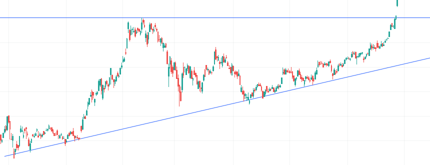
Candlestick charts take much practice to understand completely but knowing just a little bit may be a lot in your ability to recognize patterns and trends. Candlestick charts and the majority of technical analysis is based on one primary concept: Support and resistance. Support and resistance are price levels of buying (support) or selling (resistance) activity.
Support and resistance lines are price levels at which the stock tests, often multiple times. How do we identify these points? Just look at the stock chart:
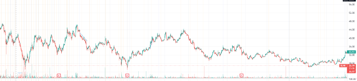
In the picture above, the stock touches the points towards the bottom a few times. It also touches the top a few times. It may be a little hard to see so let’s draw some lines:
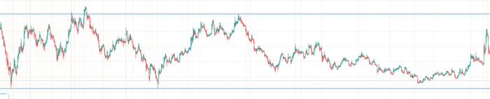
The line on the bottom acts as a point of support for the chart (almost like a floor), which stops the stock and bounces it the other way when it touches it. The same thing happens at the top line called a resistance line (almost like a ceiling), which stops the stock at the top.
How Support and Resistance Points Are Created
Support and resistance lines may be created based on passed events in the stock where there were price changes. So, if five months ago some news comes out that tanks the company, a point of resistance may be created at the top of the chart where it started to tank. Then, that point may be used as a resistance point for the rest of the chart in the future.
Or, if buyers thought that the stock was then undervalued at the end of its plummeting run, that could then turn into a support point, as it creates kind of like a “floor”.
Support and resistance lines can also be created simply from buying and/or selling activity.
All of this is market psychology and the more you trade the easier it will be to recognize support and resistance lines.
Candlestick Patterns
While candlesticks on their own may be beneficial like dojis and hammers, many traders are able to form patterns, like a broadening pattern, out of multiple candlesticks on a stock’s chart. Traders can use these patterns that form to try and predict the coming movements of the security.
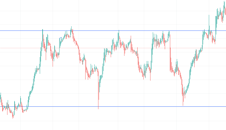
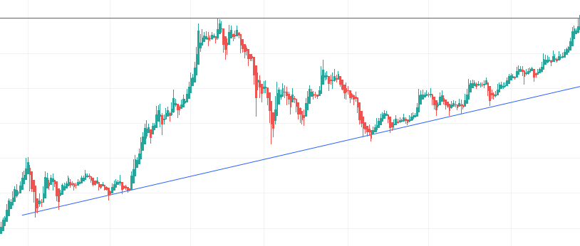
This chart uses the Heikin-Ashi candlestick type. It shows two blue lines, one support, and one resistance. The top line is the resistance line and the bottom line is the support line. By using candlesticks, the trader may be able to recognize these trends and patterns which may lead to better market predictions.
These candlestick patterns not only form support and resistance lines but also create consolidation and other chart patterns.
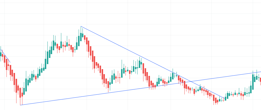
This chart pattern shows a wedge that more easily highlights the consolidation and eventually a bearish breakout of the stock price passed the support line. By using candlesticks, traders may be able to recognize and highlight patterns like this.
Candlestick patterns also do not have to be major moves in the stock price. They could be a few candles, which may represent emotion and/or market psychology, and is a reason why candlesticks are so powerful.
The Three Black Crows pattern in the image above is a popular pattern in the stock market world. The pattern is a reversal pattern where sellers are attempting to regain control of the stock. The three black candlesticks after an initial up move are sellers pushing the stock further down in an attempt to push it even further down and possibly form a downtrend. It doesn’t always reverse, but traders may try and predict a reversal when seeing this candlestick chart pattern.
Also Read – How to Use the Most Powerful Stock Market Indicator (MACD)
Where to Find Candlestick Charts
Most charting platforms have some type of candlestick feature, but here are some popular charting platforms:
TradingView
TradingView is one of the most popular online, free, and compact charting platforms. To view a stock with a candlestick chart, enter the stock’s name or ticker in the search bar and press enter. Then, press the button in the top left, next to the “Indicators” button that looks like this:

Then, press on “Candles”. Some may prefer to use the Heikin Ashi candles discussed above, as they may seem simpler.
Yahoo Finance
Another popular online charting software, powered by Yahoo. To access the candlestick chart, search up a ticker in the top search bar of the homepage, double click on the area chart, press the button that looks like this:

And choose “Candle”.
Stock Charts
Stock Charts may be a bit confusing for beginners, but it is very compact with features. To access a candlestick chart, search up a ticker in the search bar, and wallah, a candlestick chart has appeared. You can change the settings as you wish.